
Overview:
This case study started as an investigation to understand what are some of the underlying reasons for the lack of employment diversity among Black and Latino Americans in the design and technology space. Throughout the 7-weeks of this course, I conducted a series of interviews with hirers in the UX field to gain better insight into the hiring practices and the challenges of supporting corporate values of diversity and inclusion.My response to support employment diversity is a product called “Colorbook”. This product helps connect underrepresented population with employers that welcome diversity.
Problem:
According to the 2019 Google and AIGA design census. White / Caucasians make up 71% of the design community, Asians 9%, Latin / Hispanics made up 8 %, Black / African Americans 3%, Native Americans and Native Hawaiians made up less than 1% combined. While in comparison the racial make up of the United States depicts a greater eligible population share. based on 2010 US Census Whites make up 60% of the US population, Asians roughly 6%, Hispanics make up 18%, and African Americans made up roughly 13%. Based on population, whites and Asians seem to be overly represented in the design community, Native Hawaiian and Native Americans were proportionately represented, and Hispanics and blacks were grossly underrepresented. The overarching goal of this project is to raise awareness of this disparity and spark the conversation of how to be more inclusive of those who desire to work in this space and create opportunities for successful partnerships.
Users and audience:
The application is designed to connect hirers in the design industry with a multicultural talent base.
Roles and responsibilities
Created the initial concept, branding, visual, and interaction design, as well as conduct formative research, and usability testing.
Scope and constraints
There was no budget, 7-week timeline, worked independently, developed participant list, conducted remote user testing. Constraints were, having $0 budget, working remotely, and an aggressive, 7 week timeline to complete the MVP of the mobile experience for both
User groups.

Research
Interviews:
I conducted five interviews with UX managers at respected design firms, to try to understand drivers that may be playing a role in the lack of diversity in the industry.
Insights:
Hirers couldn’t place why they weren’t receiving a proportionate number of applicants of color. While most of the applicants report that their own companies were pro diversity and inclusion, the applicants just weren’t there, and while a few participants had opinions, none could pinpoint why that is.
All of the participants expressed a positive attitude towards having more diverse companies/teams, none of them had any explicit recruiting practices to find these diverse candidates or track how many of their own applicants were people of color.
All participants reported either a disproportionately low volume of applicants of color, compared their white counterpart, or no awareness of the volume of applicants of color all together.
From my research, I gathered that lack diversity on the hirer’s part wasn’t for lack of trying, but lack of a focused approach to recruit for diversity. In my opinion, this challenge creates an opportunity for a tailored experience to meet this need.

Empathy Maps
At this stage I created empathy maps to further understand each user group’s needs and pain points. This would inform the design decisions made from this point onward.


User Flows
Here you can see the initial user-flow and wireframes for the each user type.


Product Features:
Onboarding
I designed the on-boarding experience to be simple, easily understood, and delightful. With calls to action for hirers, looking for talent, de- signers, looking for career opportunities, and for anyone who may be interested in learning more about Colorbook’s efforts to give back to under- served communities.


Designer Profile
The designer profile serves as a snapshot of the user’s skills and experience, while also providing contact information and links to the user’s social media, portfolio site, and resume. The designer profile also captures the user’s desired pay, satisfaction rate, and geographic location.
Designer Sign-Up User Flow
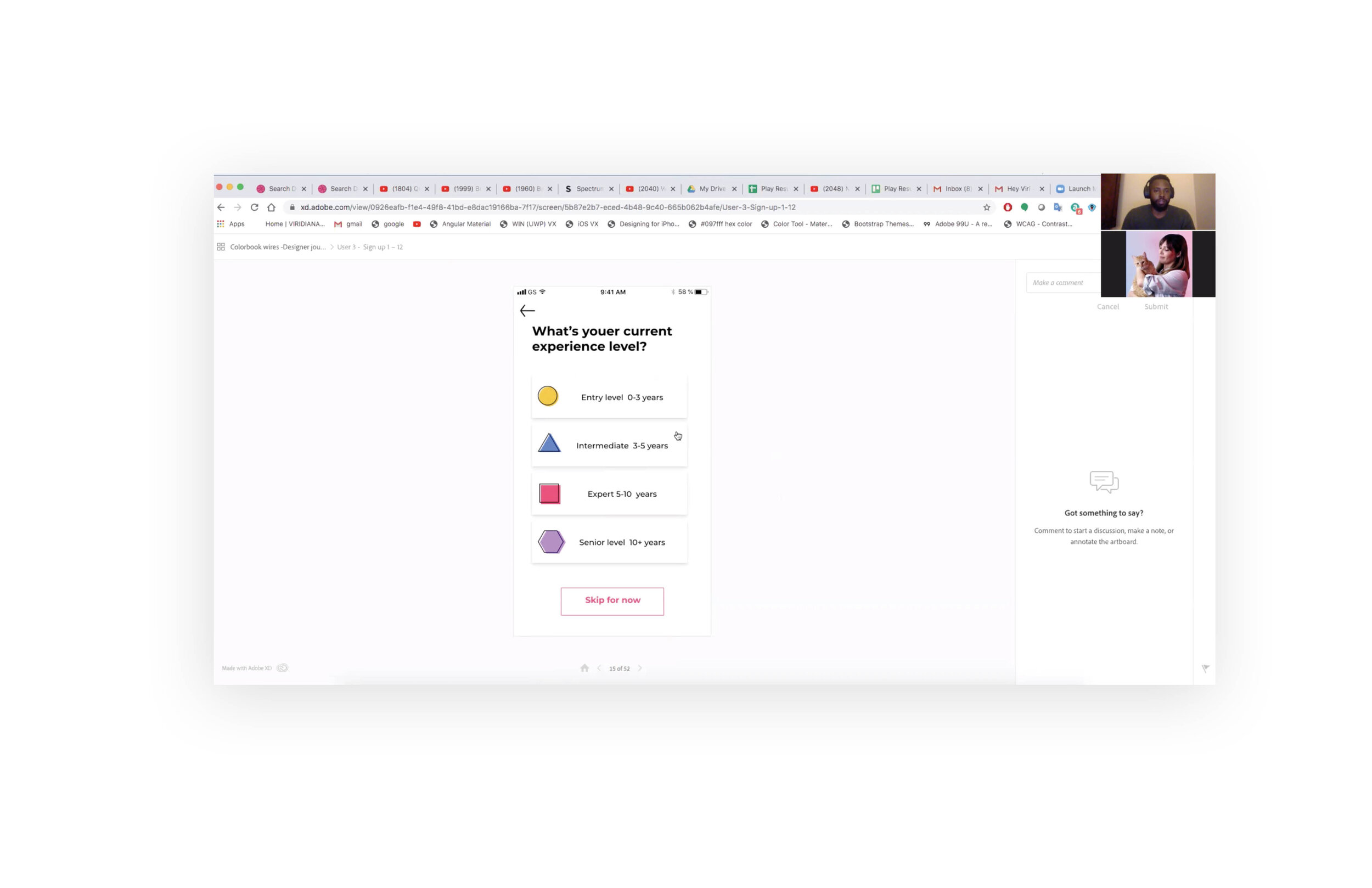
Here you can see how designers, while creating their profile can communicate what their skills are, as well as their level of proficiency. I thought that it was important to create iconography that spoke the same language as the designers that would be using it, in order to create an experience that felt familiar and engaging.


The Short List
The “Short list” is a feature that serves up recommended candidates to the hirer, based on preferences defined by the user. Hirers are busy people, this feature was designed to make the process of finding applicants more streamline.

Feed & Listings
The feed works as a home screen when the user is signed in, this is where the designer will be able scan their feed, as well as search for more specific results. From there the designer can click on any listing and apply for the job in a matter of seconds.


Messager
Messenger feature allows hirers to message designers directly.


Branding
Logo & Brand elements
I wanted to craft an experience that was delightful, vibrant, and convenient. The name I arrived at is “Colorbook” because at its core the application would be a database, or book that connects de-signers of color with career opportunities. I knew finding the right sans serif font family was crucial, I decided to use the Montserrat typeface because of its elegant, expressive, and playful qualities fit nicely with the tone I was trying to achieve.

Brand Elements
There’s an abundance of white space to create contrast and make the colorful elements jump off the screen. I use primitive geometric shapes, contrasted by black outlines and abundant white space to visually allude to an actual coloring book. The visual elements also serve as a metaphor for challenging the status quo, and promoting more diverse design communities.
Component Library
Here is Colorbook’s component library, comprised of all of the components that make up the application

Usability testing
User testing validated some of my initial assumptions about the prototype’s usability, and desirability. I conducted a series of usability tests with designers of various diciplines. All 4 participants were able to intuitively understand the interface. In terms of desirability, users found the overall experience to be delightful, and that if such a service existed, they would
be interest in it.

Outcomes & Lessons
While working on this case study I learned a lot about the UX process, usability testing, and conducting formative research specifically. I pushed my visual design skills further than I had on any project I’ve worked on prior to this. Overall, I consider the project was a success.
