Background:
The work discussed here is based on a project I completed for Bank of America. Since the project involves proprietary intellectual property, I will describe my roles and tasks only at a high level. Any UI examples included in this case study are approximations of the designs I created while working on the project.
Situation:
As a contract UX Designer at Bank of America, I was responsible for refactoring an existing internal application and integrating another internal tool into it, combining the functionality of both.. There was a focus on improving the application in terms of usability, accessibility, learnability, and to make the overall experience more user-friendly.
Result
The final outcome was a set of development-ready assets that aligned with both business objectives and stakeholder expectations. These assets were slated for immediate development, with a planned 2026 release to a global user base numbering in the tens of thousands.
Areas of improvement:
One of the project’s main objectives is improving the overall user experience of the platform. The primary areas of improvement are Searchability, Task Direction, and Efficiency of Use.
App descriptions:
The two applications being refactored had distinct but related use cases:
Managing service accounts, including their properties and configurations.
Automating password reset instances for service accounts through a process called “vaulting.” Vaulting replaced the manual process by pushing updated passwords directly to the associated application’s code base.
Tasks:
Redesign the existing applications from the ground up and merge their functionality.
Collaborate with stakeholders and cross-functional partners to understand the problem space, technical limitations, and business objectives.
Apply UX strategy to generate solutions, ideate, and create rapid prototypes in both low and high fidelity.
Deliver dev-ready assets with detailed annotations for the development teams.
Action:
Facilitating meetings and feedback sessions with stakeholders and cross-functional partners. Crafting design solutions using UX best practices. Conducting UX research. Utilizing existing design system components and creating custom components where needed. Managing project timelines and scope.
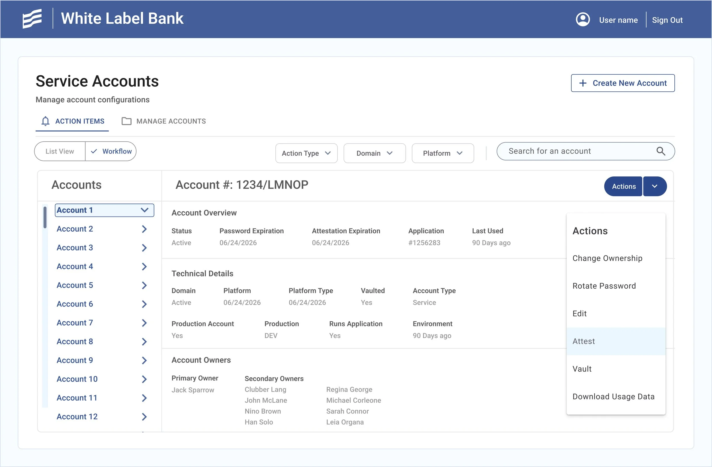
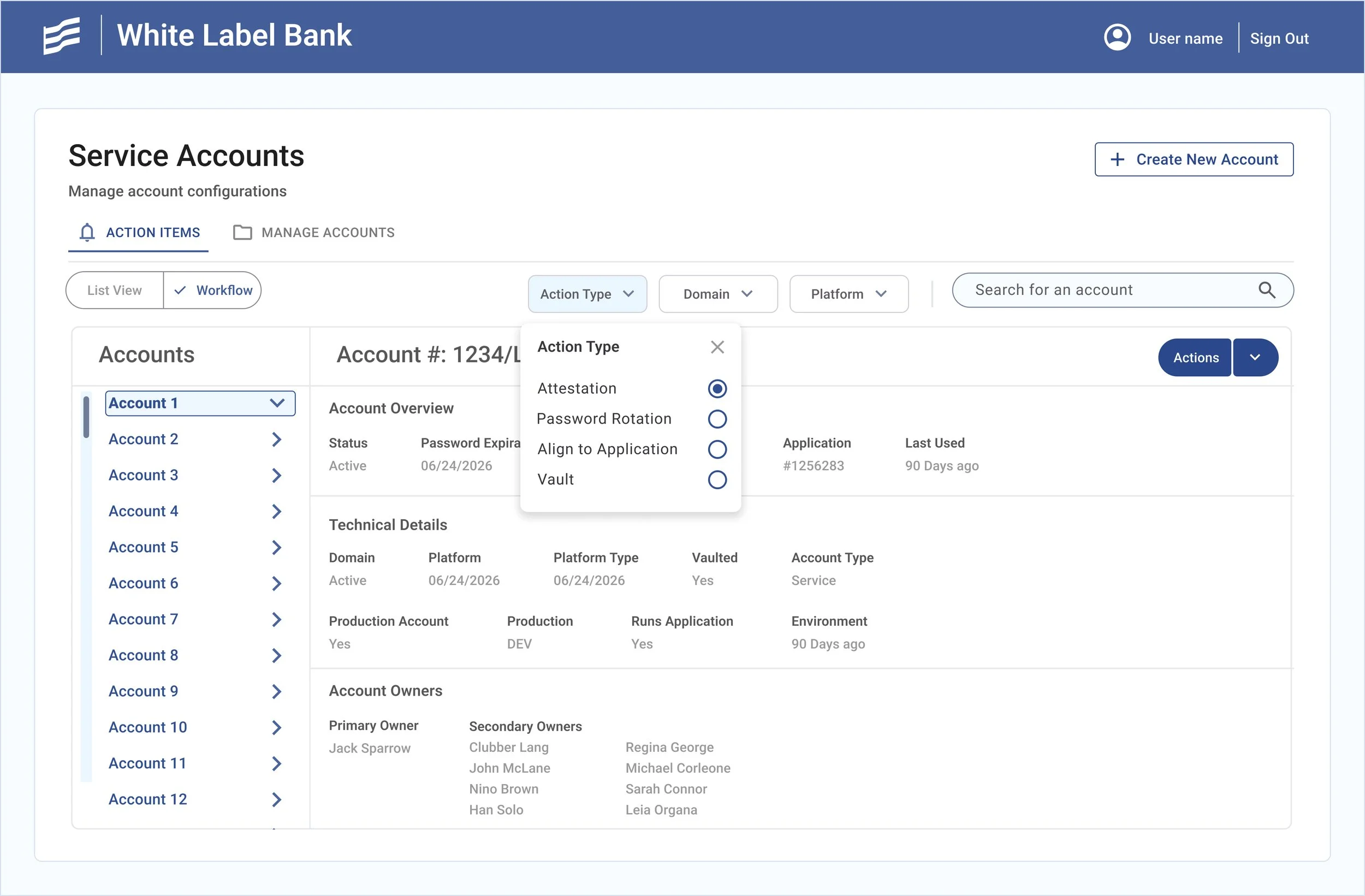
Improvements - Searchability:
In the earlier version of the application, a significant searchability issue emerges during preliminary user interviews. The home screen consists of a large, cluttered table filled with data, making it extremely difficult to locate specific accounts, similar to searching for a needle in a haystack. The overwhelming amount of information also increases cognitive load for users.
Addressing this by introducing filters that can be combined with the search function to narrow results. This greatly improves efficiency, especially since users often manage hundreds or even thousands of accounts.
Additionally, creating a toggle feature that allows users to switch between a focused workflow view and a table view of accounts. The rationale is that users with fewer accounts may prefer the focused workflow for clarity, while those managing a large number of service accounts work more efficiently in the table view, which also supports batch actions.
Improvements - Efficiency of use:
Users report issues with the application’s efficiency when performing bulk operations or working across multiple accounts. Addressing this by adjusting controls to make it easier to select large groups of accounts. Adding filter functionality in combination with endless scroll so users can select accounts more freely. Enabling the option to hide unselected accounts so users can clearly view their entire selection.


Improvements - task direction
During interviews, users share that they receive email notifications about action items but face poor visibility once inside the application. In many cases, they need to reference the email, copy the account number, and paste it into the search bar to locate the task.
Improving this by creating a landing page with a list of action items and simple CTAs that launch the task flows. Separating tasks by type, grouping similar tasks together, and adding severity indicators to show priority.


Conclusion:
In conclusion, I spent several months on this project conducting interviews, developing a design strategy, iterating on designs, facilitating design critique sessions, gathering feedback, and creating both low- and high-fidelity prototypes. I then handed off all assets to development. This case study highlights only a small sample of the screens I designed, as I fleshed out every task flow, use case, and edge case required to be developed.